Weaving E-commerce
I created an e-commerce site with all levels of weavers in mind. The goal of this site was to create a great retail experience while providing information about weaving looms for both beginners and experts. Lowering barriers to learning this craft is a key step in selling more looms.
Scope (student project)
Interaction Design (5 weeks)
Prototyping & testing (2 weeks)
Tools
Sketch
paper prototyping
The Challenge

High fidelity wireframes of the final design.
Weaving looms can be simple and cheap or expensive and complicated. Providing a resource for both beginning weavers and experts can help remove barriers to learning and purchasing.
Information Architecture
Frictionless Experience through IA
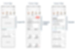
Using some comparative analysis I created a site map. I also created a purchase flow chart assuming that someone might start by doing research on their phone and then switch to their desktop computer to complete their purchase.
These extremely valuable steps helped me create a smooth shopping and navigation experience.
site map

purchase flow
Research
Keys to Making a Purchase
Before jumping into design, I conducted a competitive study with the website weavingworks.com.
A few valuable take aways were:

Reviews are very important for making a decision

Weaving jargon is too complex - need a glossary!

No breadcrumbs
led to confusion
Wireframing
Addressing Goals Through Design
I outlined goals for the business and for customers. I then set objectives for each page that mapped back to these overarching goals.
Goals for business:
-
Lower barriers
-
Sell more looms
Goals for customers:
-
Expertise based service
-
Product lifecycle support
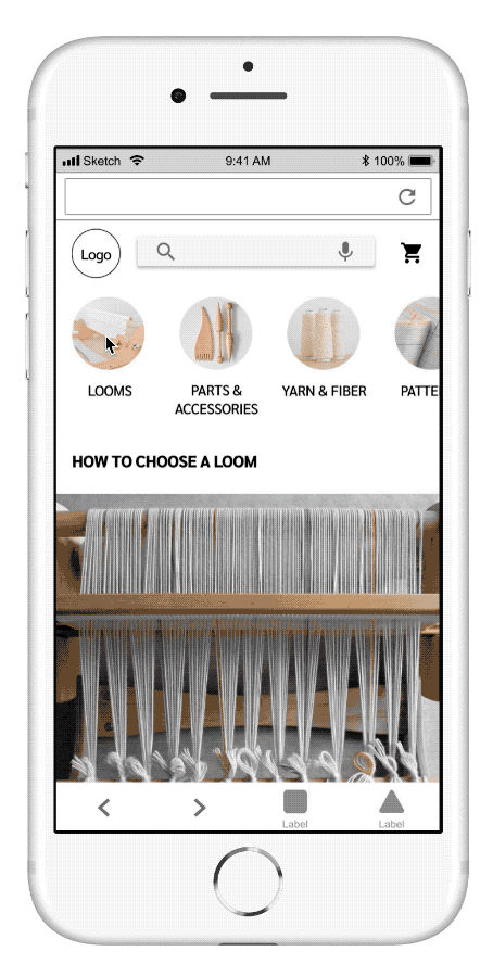
Presenting basic information on the homepage can help beginning weavers feel included and supported.
The ability to compare products and filter based on things like experience level give customers the tools they need to make informed decisions.
Providing tutorials for how to use and maintain looms can ensure that customers are supported throughout the life of the product.
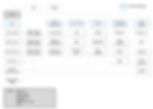
Looms can be very expensive. Purchasing expensive items often requires research. I prototyped and tested a comparison function for this site to help customers make informed purchases.
My early research showed that comparison functions on mobile devices can be challenging. Space is limited but the right amount of information is still needed to create a good experience.

Paper prototype of the comparison function.
Prototyping and Testing
Comparison Function
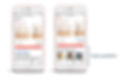
High fidelity test of the comparison function on a mobile device:
I gained some key insights during testing that informed my next phase of iteration.

For instance, on the comparison page I created a sticky header with the images, product name and price at the top of the page to allow for easy reference.
I also added photos of project examples to product pages so customers can see what is possible to make on each loom.
This mobile-first design is now ready for the visual designer to put on the finishing touches.
The Results
More Customers will Purchase
-
The well-organizing information architecture will lead to a smooth navigation experience.
-
Addressing customer needs (identified during competitive analysis) will result in a much higher conversion rate than weavingworks.com.
-
Giving customers the ability to compare expensive looms will help them make informed decisions.
-
Allowing customers to see what kinds of projects can be woven on each loom will help inspire expert weavers and inform beginning weavers.